Goodwill Nonprofit
2021-2022
Designing for Guidance
Context
MyCareerAdvisor is a digital career and learning platform used by 200K+ job seekers across Arizona, used both independently and within Goodwill career centers where staff assist individuals navigating employment challenges.
Problem
The platform functioned primarily as a static resource hub. Users created accounts, saw the same recommended trainings, and were encouraged to upload a resume. The experience did not adapt to their situation, skill level, or employment barriers, making it difficult to understand what to do next.
My Role
As the first Product Designer, I introduced UX practices and led foundational product work including a heuristic UX audit, onboarding redesign, homepage redesign, and training experience redesign, while running workshops and introducing analytics tracking.
Outcome
The work established UX foundations for the platform, including a redesigned intake flow that launched shortly after my departure, improved structural layouts for key pages, and alignment around long-term vision of a more guided digital career experience.
Problem
Lack of guidance created a fragmented user experience
Early analysis revealed that the platform provided useful resources but lacked structure for helping users progress toward employment goals.
Within my first three months, I conducted a heuristic evaluation using Nielsen’s usability heuristics. The audit identified 20+ usability issues, documented through annotated screenshots and presented to product leadership and engineering.
Product before redesign
Fragmented Navigation and Unclear Steps
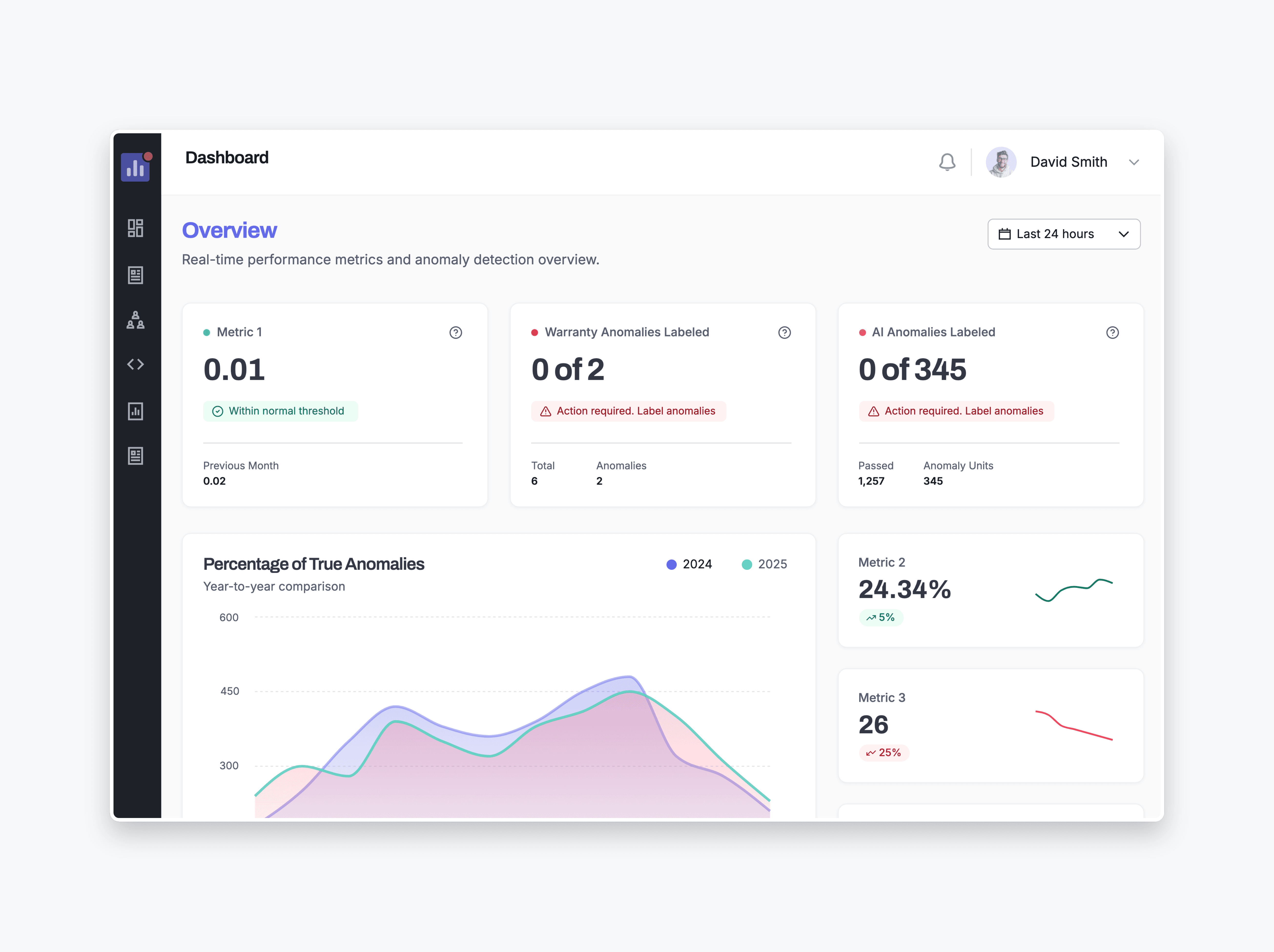
The homepage presented generic recommendations without clear next steps or progress through the job-seeking journey.
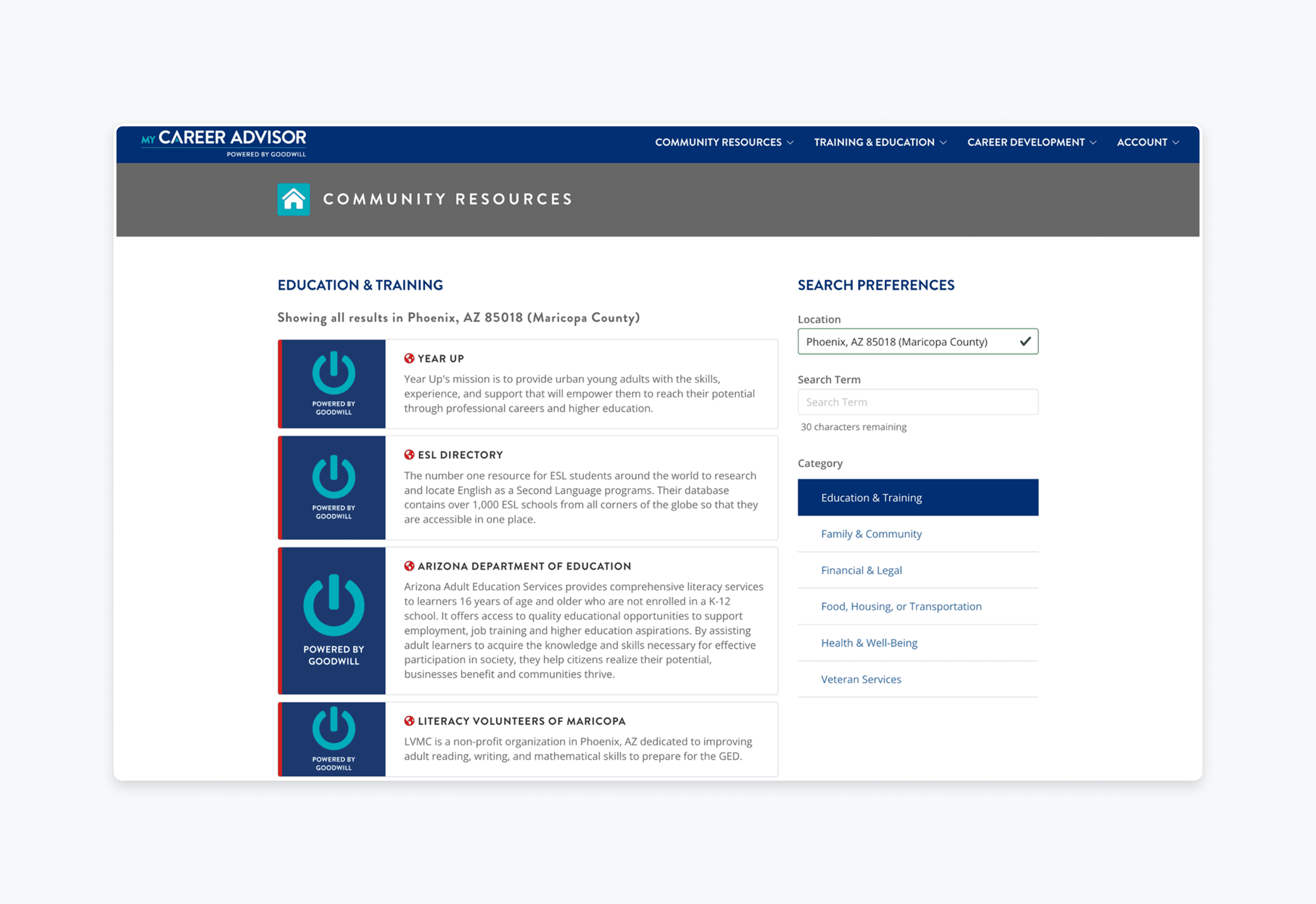
Training Content Difficult to Explore
Training modules were presented in long linear lists with limited visual hierarchy, making courses difficult to scan or prioritize.
Onboarding Collected Minimal information
Account creation required only name, email, and password, leaving the platform with little context about users’ needs and limiting its ability to guide next steps.
Design goals
Guiding users toward clearer next steps
The redesign focused on establishing foundational improvements while exploring how the platform could evolve into a more guided digital experience.
Introduce an intake flow to capture user context
Design an intake process that collects employment preferences, education background, and potential barriers so the platform and career center staff have better context about each job seeker.
Clarify homepage structure and next steps
Restructure the homepage layout to make key tools and actions easier to understand, helping users quickly identify what they can do next on the platform.
Improve training discoverability and navigation
Redesign the training experience to make courses easier to scan, explore, and navigate through clearer visual hierarchy and improved content organization.
Design decision 01
Creating a digital intake flow to collect meaningful user context
The original onboarding process collected only basic account information. To better support both users and career center staff, I designed a step-by-step intake questionnaire to gather information about users’ employment goals, background, and potential barriers. The intent was to provide more context that could support both digital guidance on the platform and in-person support provided by career center staff.
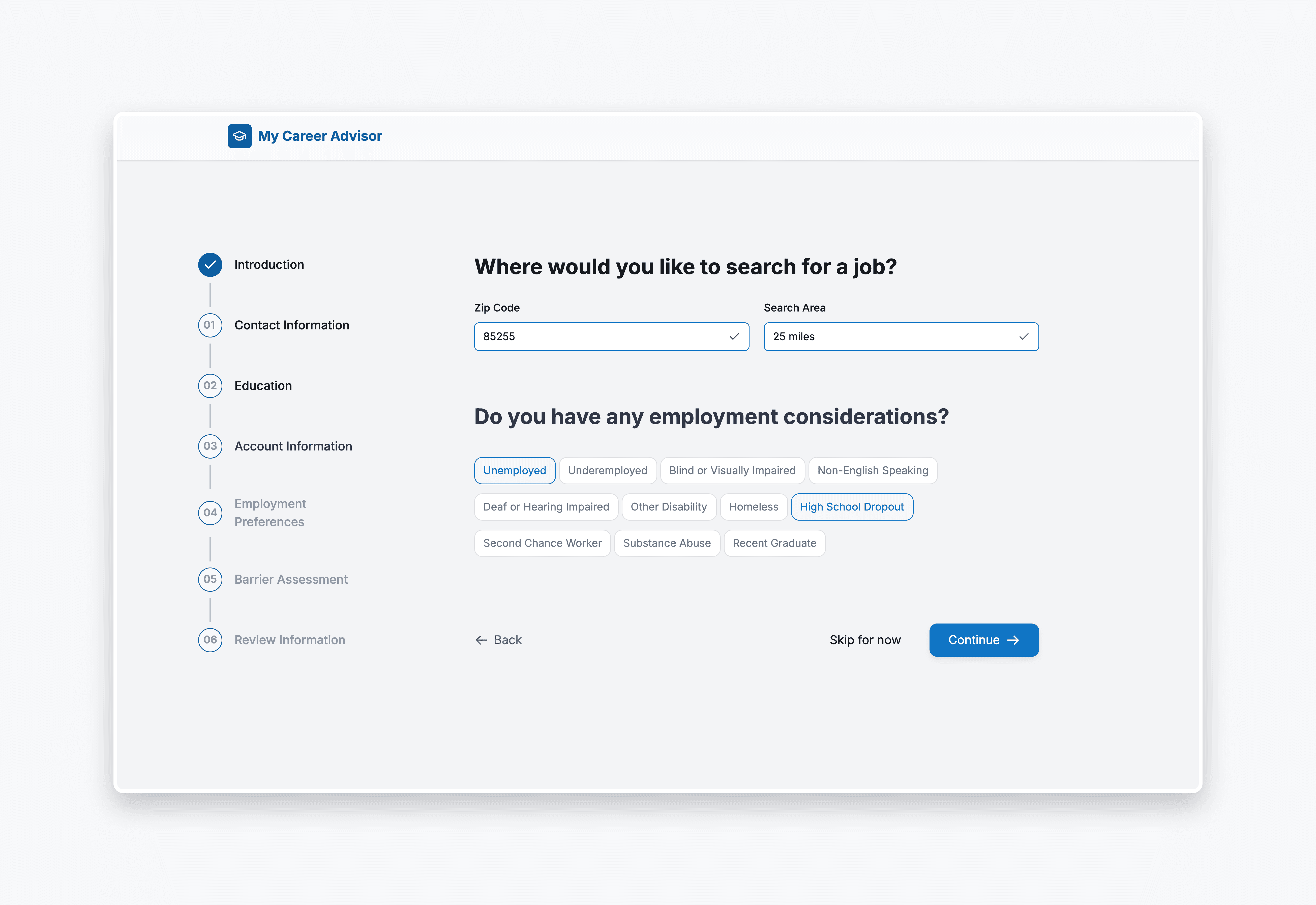
1. Multi-Step Questionnaire
Capturing employment preferences, education status, demographic context, and barriers to employment
2. Option to Skip
Reduce friction for users with limited digital experience
3. Step-by-Step Layout with Progress Indicators
Make the intake process easier to navigate
Design decision 02
Restructuring the homepage to highlight actionable next steps
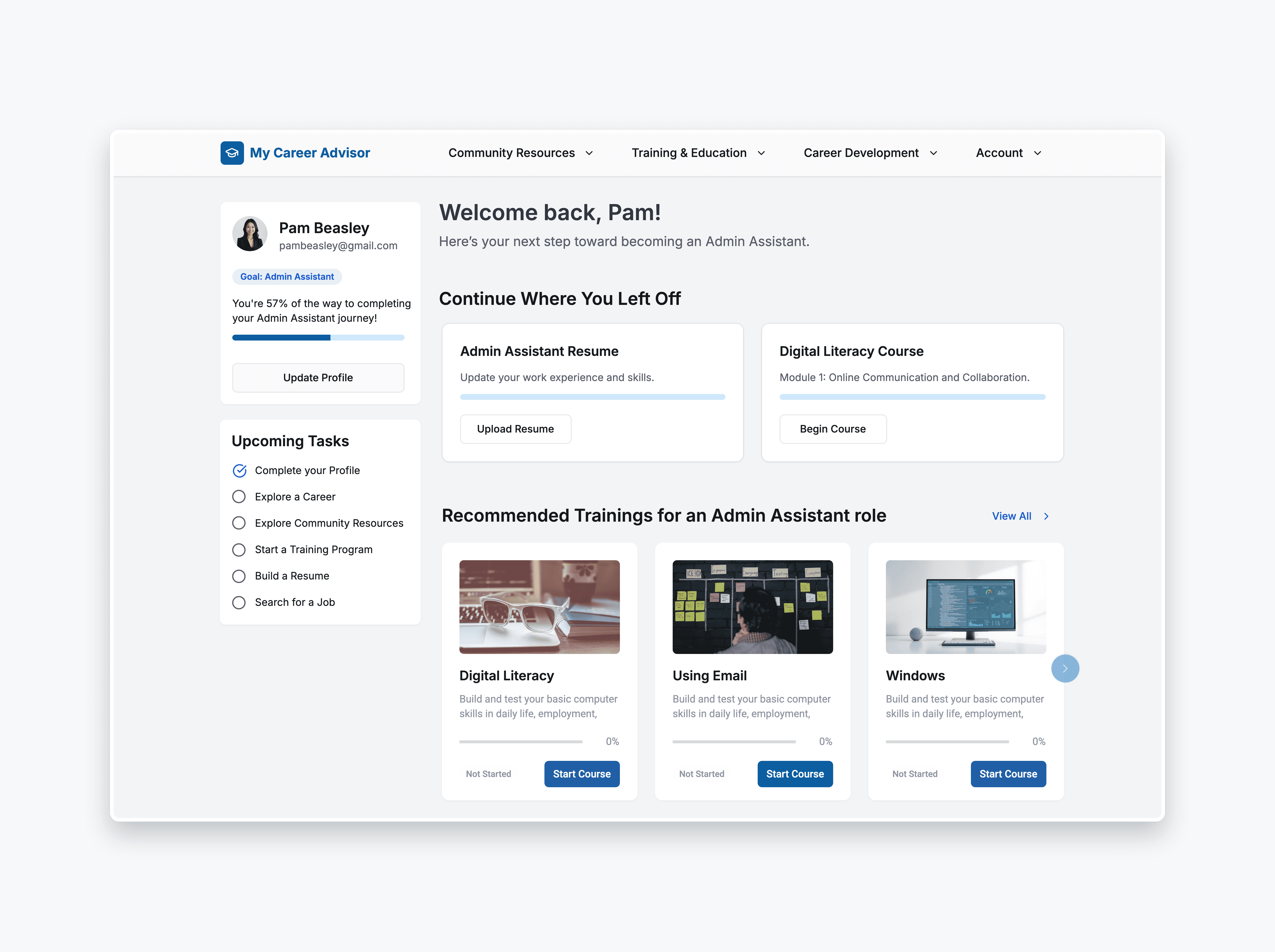
The existing homepage functioned primarily as a static content hub with limited hierarchy or clear next steps. I redesigned the layout to emphasize clearer structure and highlight potential actions users could take within the platform. The updated layout aimed to make key tools and resources easier to identify and navigate.

1. Restructured Layout
Emphasizing key platform actions such as training, resume building, and job search
Clarity
Clear entry points to major tools and support resources available on the platform
3. Visual hierarchy improvements
Make the intake process easier to navigate
4. Support future personalization
Design the structure for future personalization logic to be implemented
Design decision 03
Improving training exploration and visual hierarchy
Training content was previously displayed in long linear lists with limited structure, making it difficult for users to scan available courses. I redesigned the training experience to improve organization, visibility, and navigation while still allowing users to browse available content freely.
Online Trainings Screens
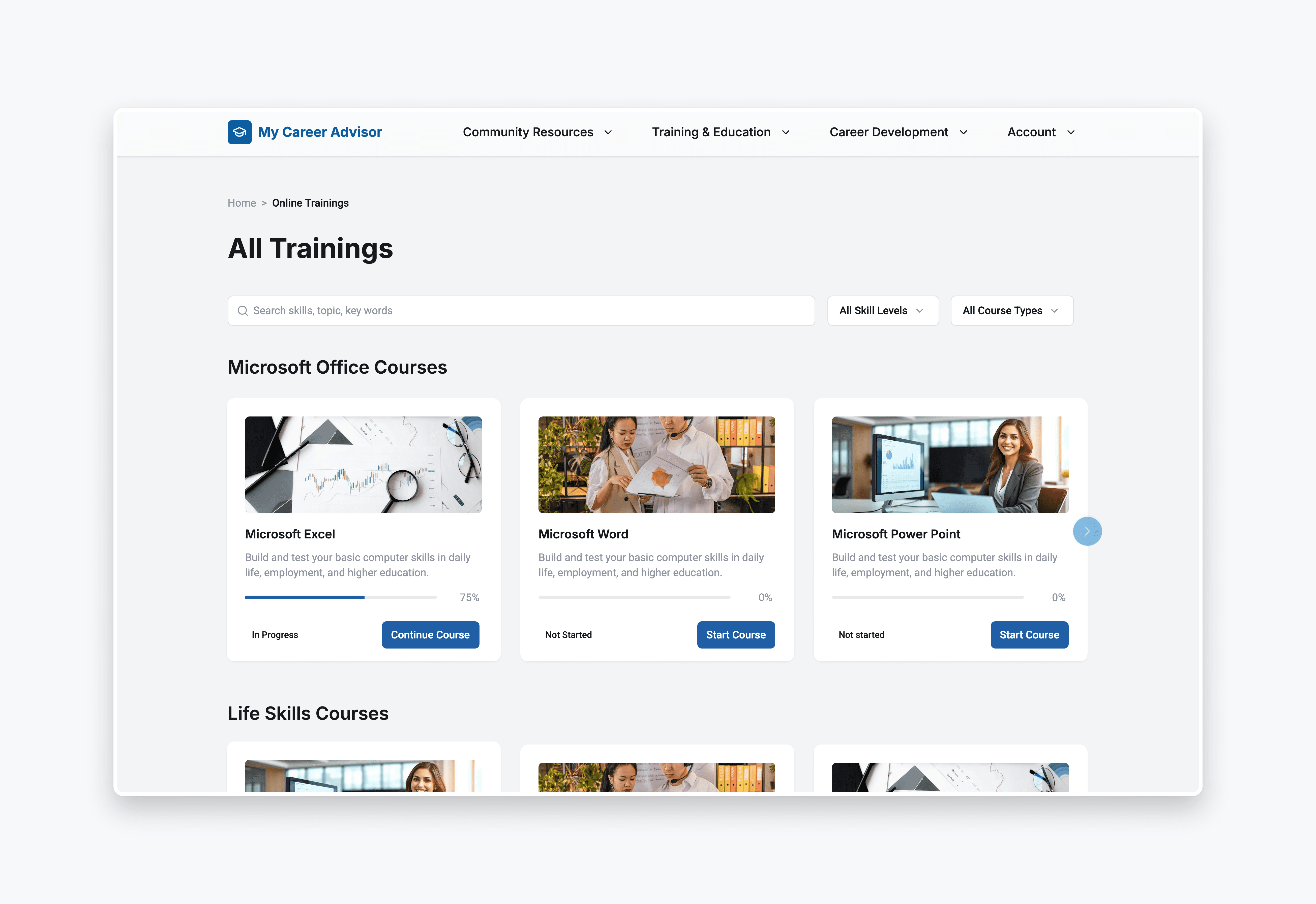

1. Card-Based Layouts
Make courses easier to scan visually
2. Clear Grouping of Training Modules
Improve organization and discoverability
3. Improved Visual Hierarchy
Highlight course titles and key information
4. Progress Indicators
Help users track course completion
Impact
Designing for guidance, not generic access
This project highlighted the challenges of designing within a mission-driven organization where product vision and technical execution evolve at different speeds. While the full vision of a virtual career advisor was not implemented during my tenure, the work contributed to several organizational changes.
Before and After redesign
Design Launch
The intake questionnaire launched shortly after my departure.
Organizational Investment in Design
Contributed to increased leadership confidence in UX as a core capability, with the design function expanding from 1 designer to 3 after my tenure.
Increased UX Maturity
Introduced UX audit, analytics tracking and design-led decision-making practices in a team without prior design maturity, influencing how product decisions were evaluated and prioritized.
Constraints
Several constraints shaped the scope and implementation of the work.
No Direct User Research Access
Insights came primarily from interviews with career center staff rather than direct job seeker interviews.
Legacy Platform Architecture
The platform had been built by an external agency and was not structured to support dynamic personalization. Implementing the advisor model would likely require rebuilding core architecture.
Limited product maturity
The organization had a strong mission but limited experience managing software product development, which made long-term implementation planning challenging.
Trade-Offs
Several trade-offs shaped the scope and implementation of the work.
Onboarding Simplicity vs Contextual Understanding
The intake flow gathered additional user context to better support both staff and users. To mitigate friction, optional skip functionality was introduced.
Incremental Improvements vs Full Platform Rebuild
A fully personalized advisor system would require architectural changes. The team prioritized smaller improvements such as onboarding and usability fixes before attempting larger structural changes.
Guided Pathways vs Open Exploration
The redesign introduced clearer guidance while preserving the ability for users to freely browse available training content.